T-Mobile Corporate Site Redesign
Extended the Un-carrier brand with a modern site and an integrated newsroom experience.
Visit the live site →
My role
UX design, content strategy
Launched
June 2018
Timeline
6 months
Client
T-Mobile
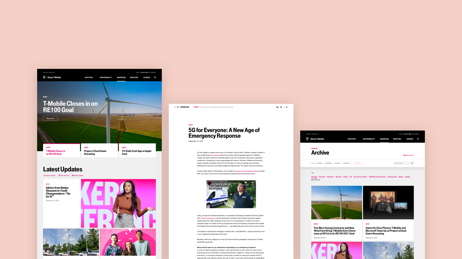
Overview
T-Mobile's corporate site needed an update to align with Un-Carrier brand and standardize design elements across platforms. My task was to take T-Mobile's digital brand beyond consumer products to their corporate identity, from newsroom, to career site, to investor relations and more.
How can we create a unified and cohesive corporate site experience that reflects T-Mobile's modern brand across all platforms?
This case study focuses mainly on my experience in designing for the newsroom experience. I was also responsible in creating the information architecture and content strategy for the entire corporate site experience. If you'd love to know more about that part of the story, let's chat.
What we knew 🤓
To create a newsroom experience that not only works for the journalists but also works with the newsroom content creators and authors, we started with interviewing the newsroom team. Additionally, we also gathered research from surveys with site visitors and web analytics. Together, we uncovered several key insights on what the needs and pain-points were for these two different users.
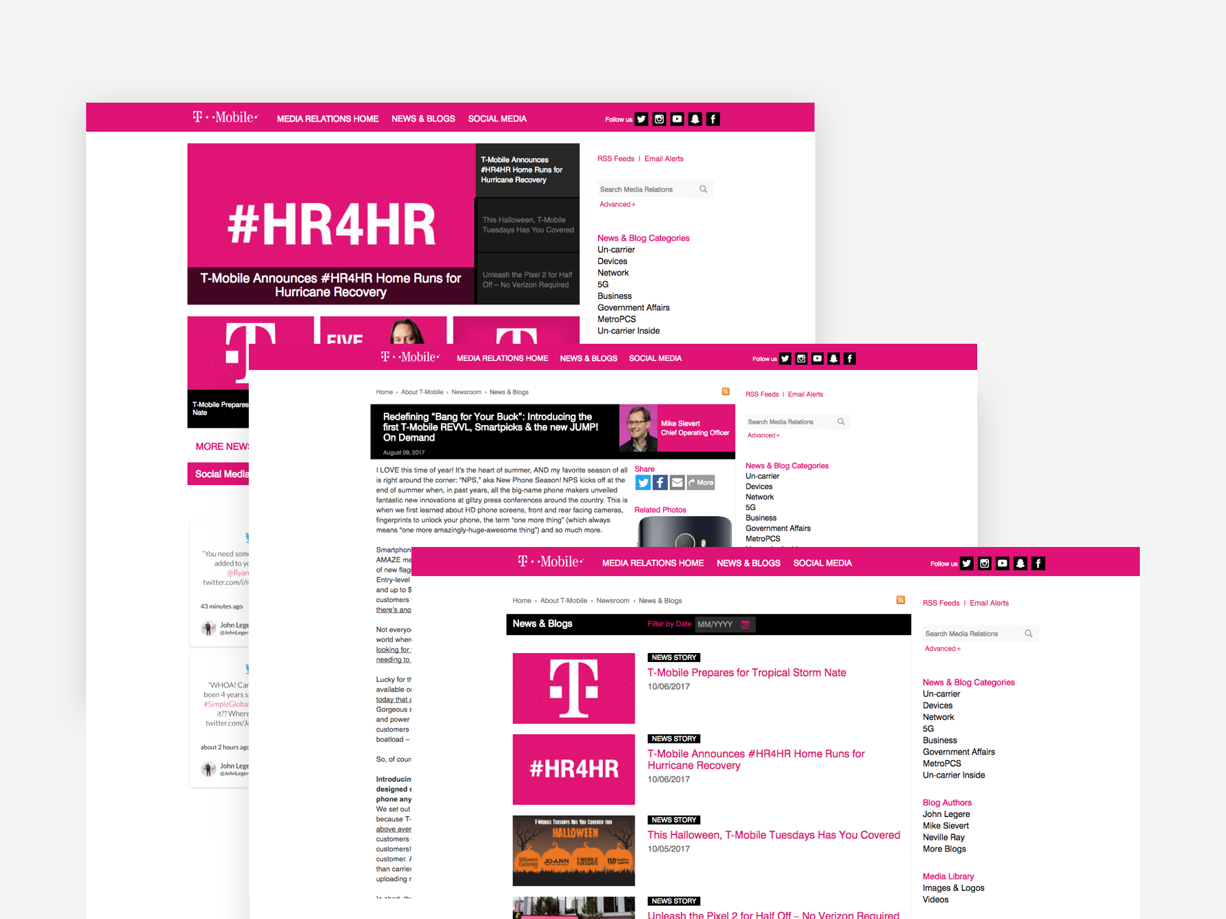
A sample screenshots from the old newsroom experience.
Journalists want to find resources they needed quickly
Tended to have already established relationship with the newsroom team and were subscribers of the newsroom newsletter.
70% of the readers visited the site on their mobile devices.
The main goals for them are to write a story, they came to the site to get the latest news, gather facts, grab assets and contact spokesperson for further information.
Had a hard time to find what they needed because the old site was scattered and couldn't drill down the content.
Newsroom authors want to eliminate redundant tasks so they focus on the important things
It was composed of a small team of two as part of the bigger corporate communication team. Both of them were comfortable with the simple HTML markup language.
Usually published a new post every week, with 1-2 articles per week.
The typical lead time for new articles was 2 weeks. The author received content in Word Docs from the corporate communication team. They were also responsible for creating any additional media as needed, and publish them 24 hours before the decided date. However, the existing web editor won't preserve any formatting. As a result, the authors were rush to publish it.
They also maintained support media content such as PDFs, b-roll videos, images, etc.
Begin with a end in mind 💪
Ultimately, we came up with these goals for the new newsroom experience:
A mobile-first approach with a primary focus on the journalists, provide them tools and resources for what they needed
Increased discoverability of the newsroom articles
Grew the readership of the article
Empowered the authors to create a more editorial experience with ways to control, customize and curate the content as see fits
Improved the authoring workflow and minimized any unnecessary authoring tasks
Design the new experience ✨
Based on these insights and design goals, collaborating with the newsroom team, I came up with the design of the following experience.
A flexible homepage
The new experience enabled newsroom authors to create an editorial experience with:
Featuring of the top 3 articles handpicked by the newsroom authors
Displaying the latest 10 articles published by chronological order
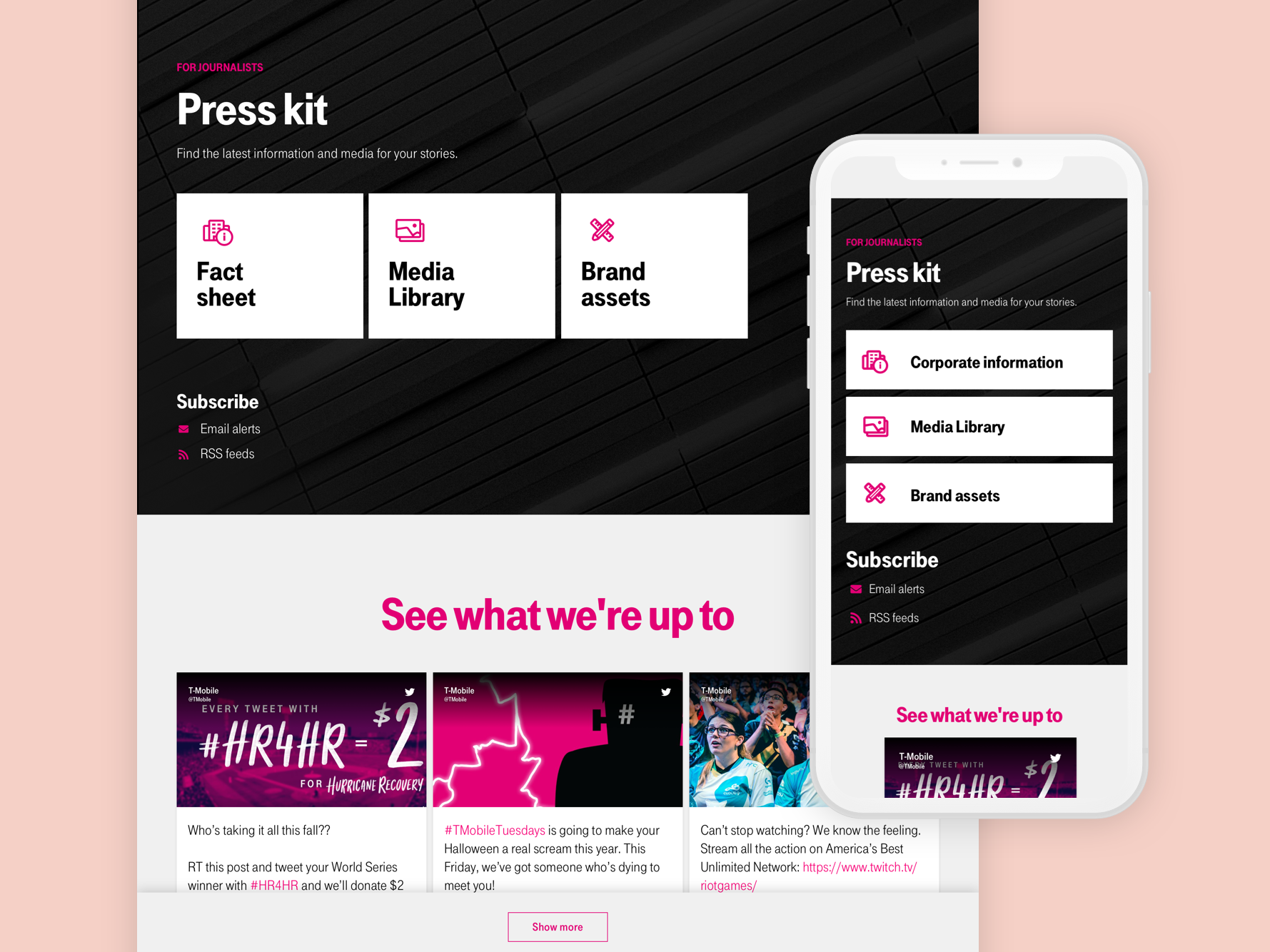
Additionally, I included a dedicated section for journalists to gather assets and information for their news articles, as well as subscribing to the newsletter. Following by a section that includes the latest posts from T-Mobile's social accounts and ways to connect with them easily.
A scalable article page
The editorial power was extended to the individual article page. The article page was built with the concept of blocks where the authors can mix and match to create the ideal article they were looking for.
For press releases, since very commonly, an article would have associated assets such as b-roll videos, images, or fact sheets for the journalists to download. I included an article resource block where the author can link any associated assets from the media library.
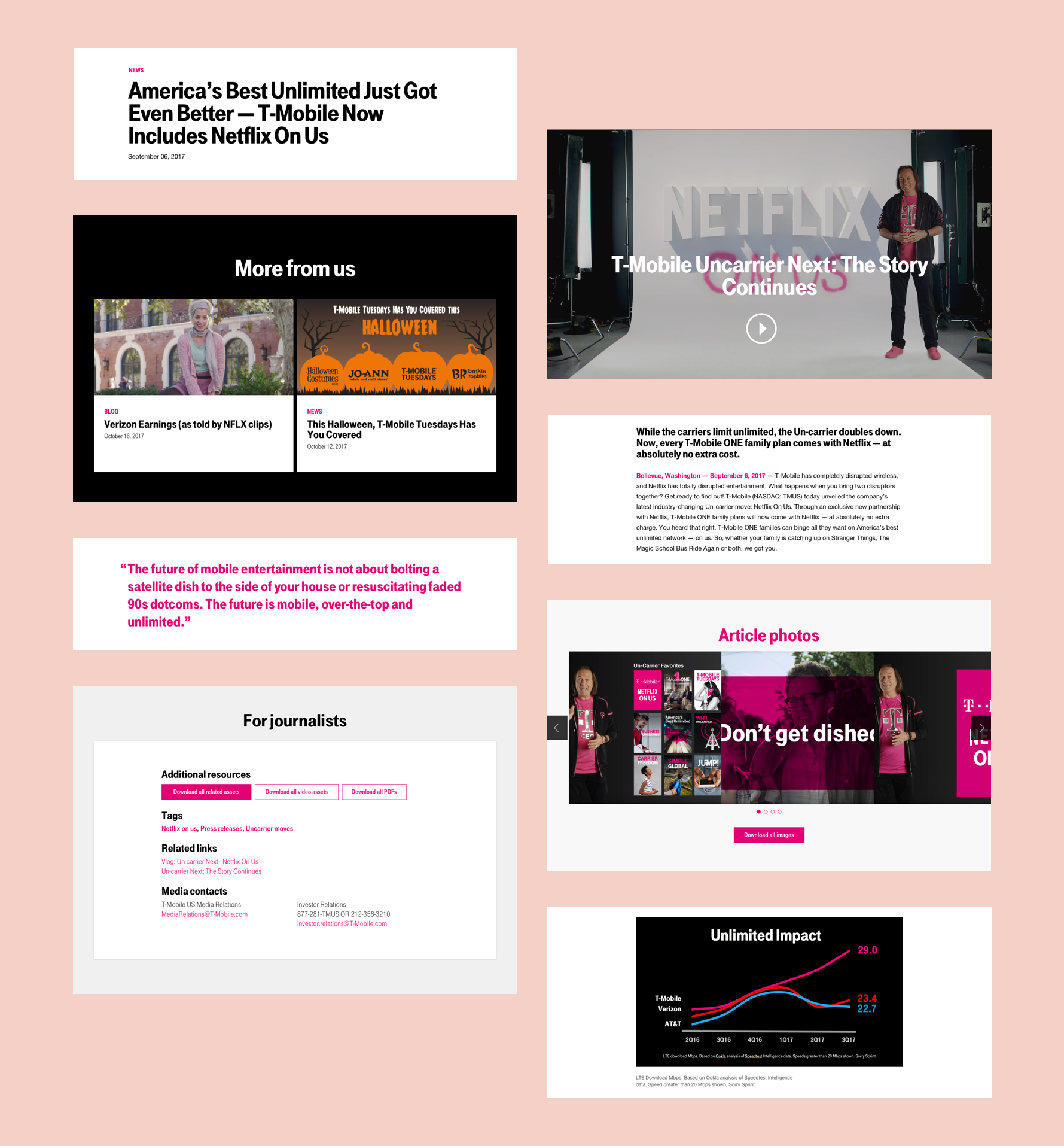
Last but not least, on an article page, I designed a new header component that enables readers to quickly jump between the sections of the sites and share the article and download assets within one click.
A new content strategy 💭
To create a content strategy that would be aligned with the new site, I also worked with the team to understand what type of content they are currently creating and what new content they would like to create in the future.
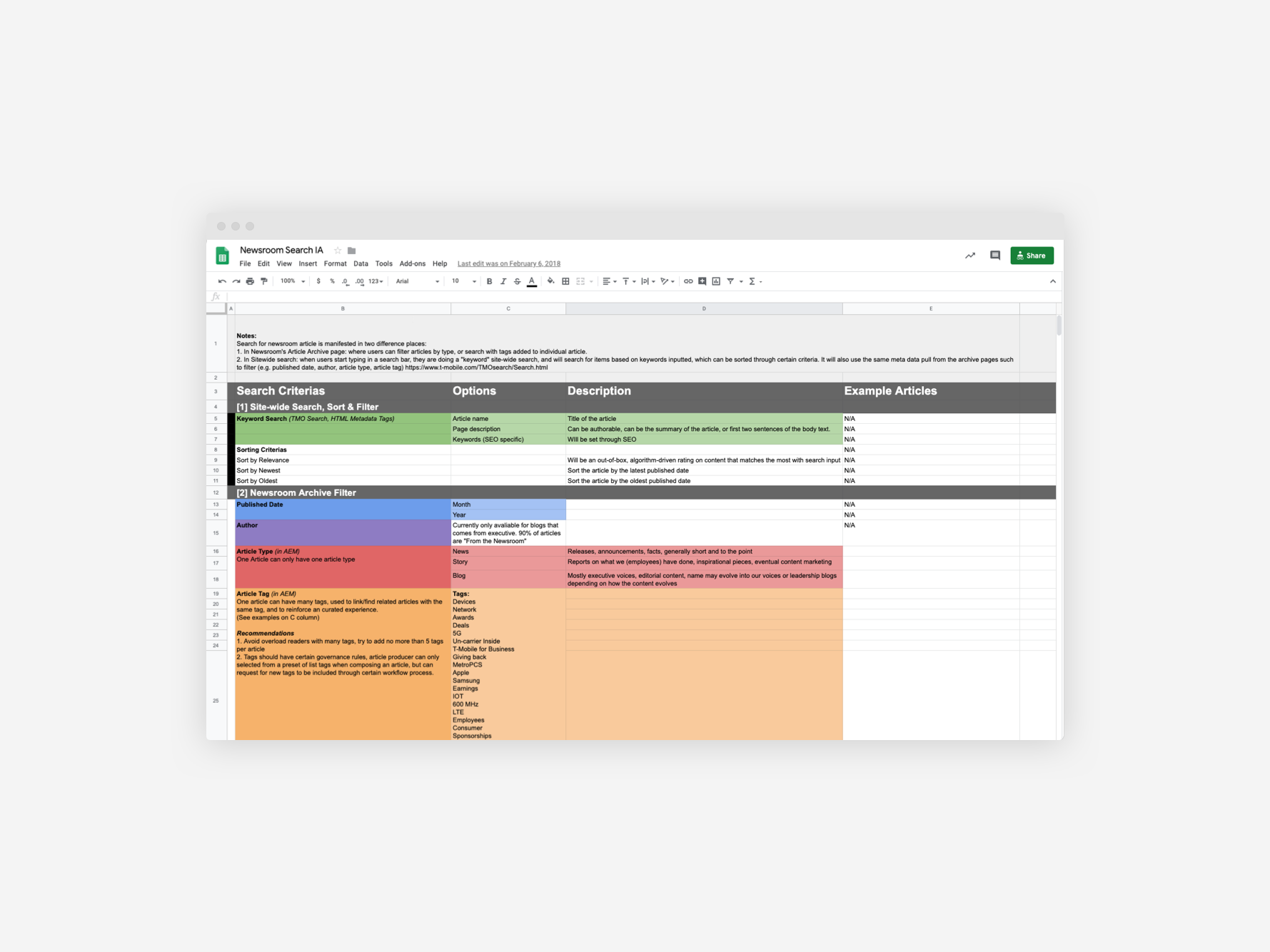
We defined three types of content that would grant guidelines for the writing and blocks to use. Tags were also included to organize the content to improve the discoverability of similar content. These data were incorporated as part of the metadata of the articles which would be leveraged for search for the global site (which I iterated on for the redesign in 2019) and content filtering on the archive page.
A brand new media library
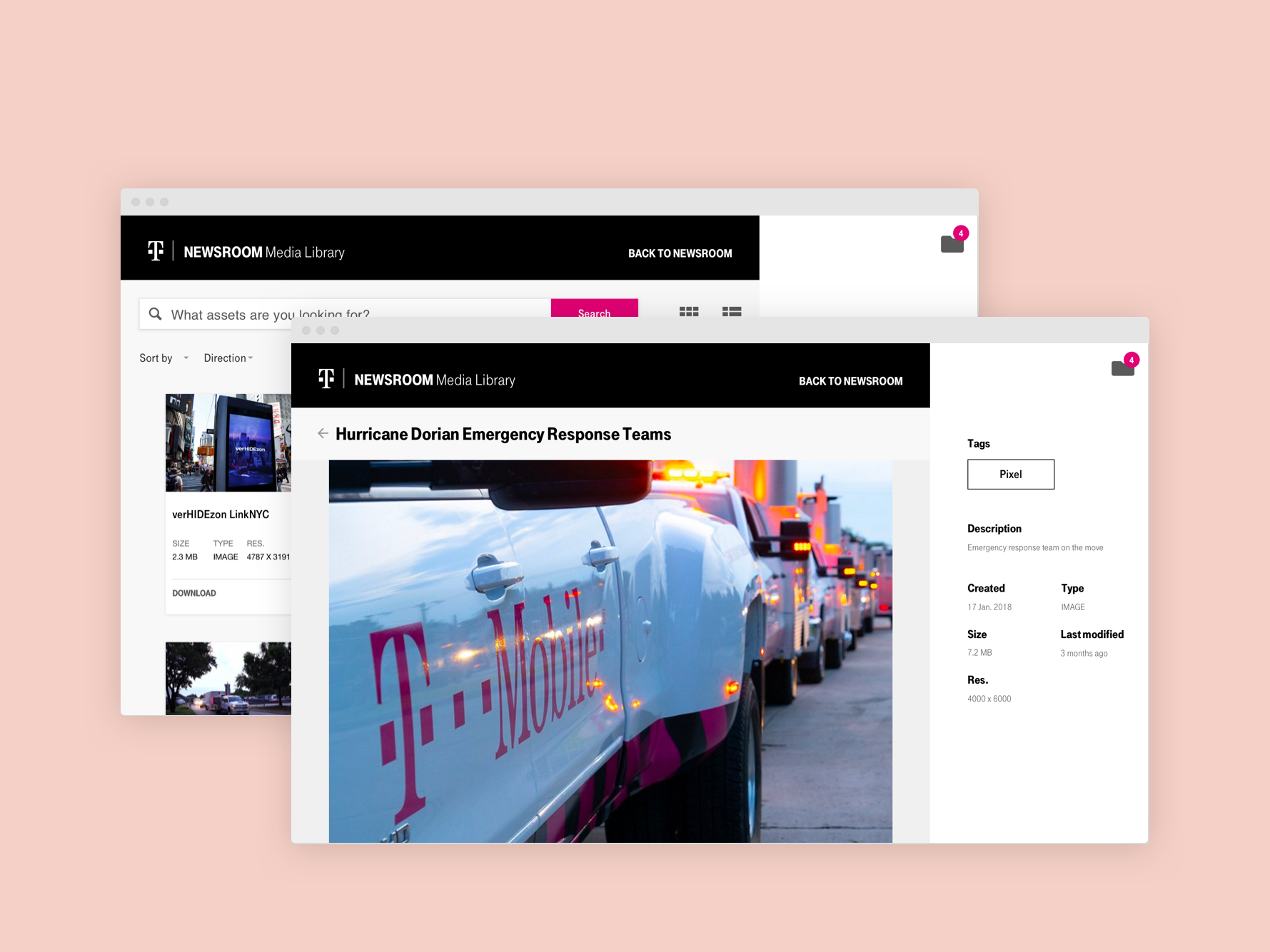
I also created the design and the organization for the media assets. It included defining the type of media and the best format to upload, as well as folder structure that aligned with the content strategy we created for the articles.
A new editing experience
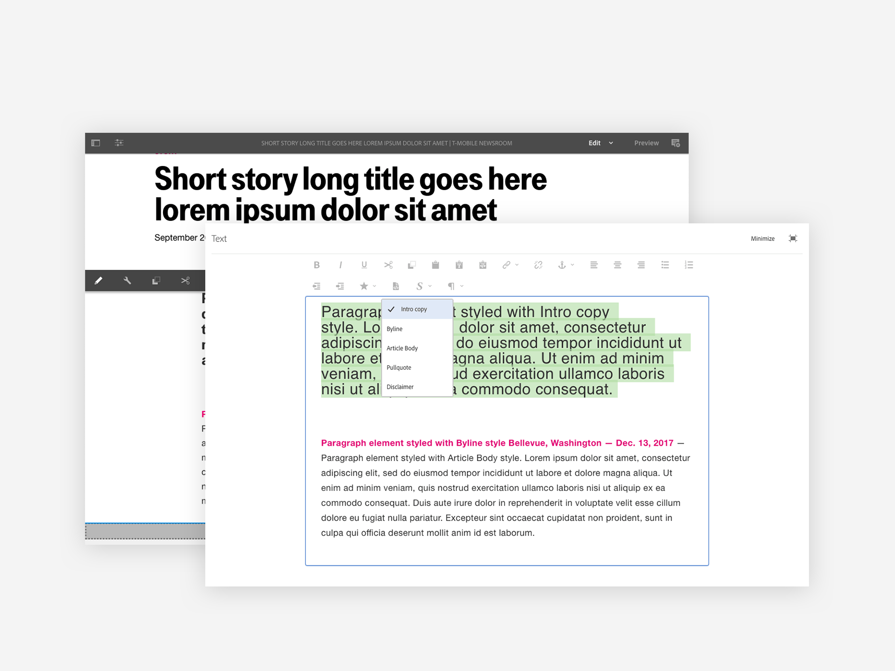
As part of the migration effort to Adobe Experience Manager, I also worked with the team to create how the editing experience would look like within the established workflow. This included providing guidance for the CMS implementation, creating article and image templates based on our content strategy.
Coming all together 🥳
With 6 months in making with partners across dozens of business organizations within T-Mobile and a technical partner, the corporate site and the newsroom was launched on June 2018. It was a massive win for the entire team. Personally, I learnt a ton from this project.
Established alignment early on is the key
The newsroom was only a fraction of the corporate site redesign efforts. As a small design team of 3, we were tasked to work across dozens of stakeholders across the corporate units within T-Mobile. It resulted in an output of 150+ pages that we audited, created or consolidated, and redesigned. To align the team, we quickly came to a strategy of bite-sizing our design approach and established a quick style guide to guide the work from 3 different designers.
Find ways to collaborate beyond the design team
As part of the process, we were on-boarding new stakeholders every two weeks. It meant that we needed to establish a relationship quickly to gather requirements and create designs for each of them.
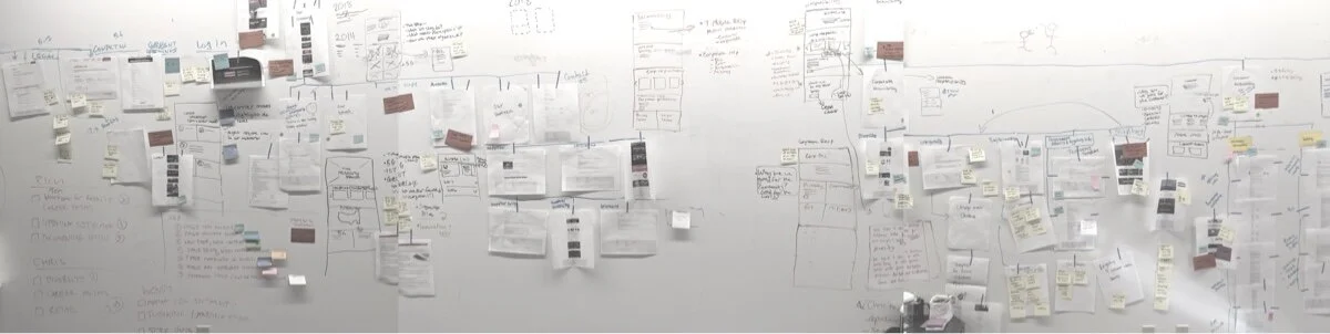
To speed up the process, I came up with a digital documentation framework to keep track of stakeholder feedback so that everybody would be aligned with any decision or risk along the way. I also create a working wall where all in-progress designs were posted and visualized. With this wall, product managers would refer to it while planning out the week, and the design team would work collaboratively to generate concepts before jumping to the design. This approach improved our communication and collaboration with both our internal and external teams.
Technical limitation and alignment
Due to the limited time and resources, we had to make compromises with our design. This included adding temporary pains to the authoring experience. Fortunately, because we were able to work collaboratively with the internal design team and development partners, these pain-points were well-understood and would be acted on in the future iteration. Additionally, as the deployment of the new content management system, the team now has the opportunity to better track their site performance and iterate base on the information.